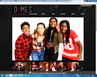
 We felt that is software was relatively easy to use and all the features were easily accessible and this software really helped us create our desired website.
My Main Contributions:
- I made the structure of the website initially, showcasing where everything would go and matching it as much as I could to the flatplan
- I changed the layout of the meet the girls page to make it more interactive and more professional looking.
- I also contributed to help make the other pages.
Initially, we started by working out a rough structure to the website and using the flat plan that we made to structure everything and then we added images.
This was what we started with and although we did like it we knew that we had a lot more work to do in order to make it look professional.
We wanted our brand to be synergistic across website, digipak and also other social media pages so we stuck to our colour scheme of red, white and black throughout.
It is conventional for artist websites to have the navigation bar at the top with their name/logo highlighted with a big picture of themselves on the home page, so we have adhered to this convention.


We then decided to have an 'Enter Site' page like many other artists such as One Direction because it allows us to promote our music video and album straight away.
Also, just to add a bit more interactivity to our website, once you click on the 'Enter Site' button, it redirects you to our home page but a message also pops up offering the audience to subscribe to us for daily updates etc.
 After this, we decided to revamp our homepage as we liked the layout but we weren't happy with the sizing of things, the pictures we initially used and also we lacked a bit of interactivity
The changes we made are:
- We made the logo a lot bigger
- Added a subscribe button for interactivity
- Changed the pictures so that now they look more professional and represents us a band better
- The big picture now changes as well, it scrolls by itself as the user in on the page
- We added a bold red line under the whole header.
We then got to work on all the other pages.
We changed that so now when you click on the meet the girls page it shows individual pictures of us and then when you click on the picture, it takes you to a different page with information about that specific girl.
 The Store page definitely took the most amount of time and effort as we had to create each piece of merchandise individually and then add it to our site.
We used the website shown below to create all of our merchandise:

This website was very useful as it gave multiple different angles to view our products and for clothing items, it even showed us pictures of models modelling our clothes. It was also easily customisable, allowing us to change the colour of the products, resize the logo etc.
 |
| This is an example of all the different angles the website allowed us to have of our product |
 |
| This is how we resized and cropped our logo |
 |
| This is the colour choosing option, a variety of colours were provided |
 |
| This is a picture showing the model modelling our merchandise which makes it more appealing to the audience. |


No comments:
Post a Comment