We decided to have 7 different sub sections to our website:
- Home
- Meet the Girls
- Music
- News
- Gallery
- Tour
- Store
Our reference points were:

Neon Jungle's home page was very vibrant and inviting. It automatically draws the viewer in with bright colours and a large image as the banner. From this we decided that we wanted our home page to look this exciting with the band picture in big as the banner.
You would usually think that a 'news' page would be pretty standard and boring but Fifth Harmony have jazzed it up with vibrant colours, loads of images and a non-symmetrical format which means our eyes can scroll the page more at ease rather than a huge block of symmetrical boxes. This is something we want to incorporate in our own website.
One Direction's tour page is really plain but it's straight to the point. It's simple to scroll through and tickets are very easy to access. We want this ease of buying things also incorporated in our website so that the audience doesn't have to work for it. The opportunity to buy tickets are presented to them quite easily.
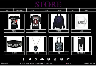
The merchandise page from Fifth Harmony's website was easy to use in a conventional format. Everything was presented with really nice pictures and again, very easy to use for the audience. We want to follow this format for our own store page.
Another thing that was common across all three websites was that there was a lot of interactivity, a lot for the audience to do and a lot of purchasing opportunities.

Having looked at all these amazing websites, we set to work on drawing out our flatplan. Initially, we drew it by hand and once we finalised everything, we drew out a template on the computer.


No comments:
Post a Comment